Do you suddenly feel a warm embrace of serenity emanating from your computer screens? Are you tired of the soul-crushing experience of clutter or hoarding and know deep down inside there’s a “better way” of living through design? Well, dear Crasstalkers, today’s post will be one of many columns about a group of magical people who live in the magical lands of Scandinavia. Continue reading
design
27 posts
Dear Lala,
I am submitting a few pics of what is probably the most heinous bathroom ever. At least I managed to get the brown and gold swirl flocked wallpaper off the walls…yeah. It was that bad. So this is an improvement if you can believe it.
My style is traditional. Not just because I find it comfortable, but for purposes of resale, its easier to sell something traditional than it is a Japanese soaking tub, glass block walls, or something equally out-there (for NJ anyway).
My budget is as low as can be. I’m honestly not sure of how much any of the work will cost (I’m waiting on estimates). The joists run parallel to the bedroom walls on either side of the bathroom. Moving the toilet (assuming its currently centered between the joists) will give me up to a foot of possible movement. I don’t want to move the toilet to a position where a joist would have to be drilled, since it could compromise the structural integrity of the joist.
Help!
Ditzy Blonde
Dear Ditzy,
I can assure you, this is not the most heinous bathroom that I have seen but I feel your pain. It is a daunting task planning a bathroom renovation because it requires so much skilled labour to get the job done- plumbing, electrical, carpentry. It can also yield the highest return on investment when selling your home. You have some homework to do and decisions to make!
No one has an unlimited budget so it is important to make a list of your deepest desires and a list of your actual needs. Ultimately, every good reno will have a mix of splurge items and budget basics. My non-negotiable here would likely be a custom walk-in shower and separate bathtub. I could live without custom cabinetry because so many vanity and storage cabinets come in such a wide array of stock sizes, shapes (and finishes) that can create a nearly custom fit. Staying with a neutral palette & a classic design scheme will also allow you to get creative (read: frugal) when it comes time to shop.

So, let’s talk floor plan. I hate to start my first design advice post by disagreeing with your contractor over toilet position but I can’t help myself. Nothing makes this princess want to stab herself in the eye more than a conversation with a contractor. I am not saying they don’t walk away feeling the exact same about me, I am just saying.
Unless I am reading your plans incorrectly, I don’t see a reason the toilet cannot be moved/stack rerouted along or up that backwall with perhaps the worst case scenario being a possible bulkhead below. Since I don’t have plans to the floors beneath, I will not belabor the point. I will revisit it a few short paragraphs away…

Toilet position aside, the double entry from the master and guest bedrooms is taking up a lot of precious real estate. I know this layout provided endless sitcom fodder on The Brady Bunch but I’m not sure I want to be in any bathroom comedy situation with overnight guests. I recommend you position a single entry from the hall. You could still maintain a hall linen cabinet on either side of the door but I might be more inclined to opt for a roomier shower and max out storage on the vanity wall. The splurge in this scenario is the custom fitted glass wall & door of the shower with full tile wall. You can offset this by choosing a drop in tub that fully covers the deck surface & selecting from stock cabinetry.

 Make sure to provide ample lighting from multiple sources, usually meaning window, recessed, sconce and hanging. Really make your space sparkle- the space is gutted, so be sure to take advantage: have recessed lighting and sconces on separate switches with dimmers. Choose simple, classic fixtures and hardware.
Don’t be afraid to use large tiles in a small space. A nice 12″ x 24″ porcelain tile will feel luxe. I love porcelain tile, it has the depth and feel of marble (without the $) and the available colours will mix beautifully with marble countertops. Most large DIY stores carry ready-to-install counters in crema and carrera marble. I suggest mixing the same color tile in a variety of sizes, in the same shape: 12″x 24″, 4″ x 6″ subway in the shower, and maybe a smaller mosaic or basketweave for the vanity & bath backsplash. The continuity of colour is really calming, the mix of texture keeps it interesting and fresh.

I cannot end this post without including the plans that place the toilet where I want. Because I am a princess and because I cannot stop redesigning your master bath.
The same principles always apply- there is custom luxury and builder basic in equal measure.
1. Beautiful, traditional mix of creamy, dreamy tile, rich toasty wood, painted panel moulding with freestanding bath. *Best part: toilet is hidden behind wall. I do this whenever possible. Tub, vanity and faucets are all from Lowe’s so keep abreast of those sales! Tiles and tubs get discontinued, thus discounted regularly.

2. Probably the closest plan to the drawings you sent me and likely the the most budget friendly in spite of that pesky loo because I have left the doors. Comedy gold, Ditzy!
Insignia linen cabinets and full tub surround are also all from Lowe’s. I recommend injecting some luxe in this scheme by adding the mosaic detail in the center of the room, a tiled ‘area rug’, if you will. Repeat the painted shaker detail on the facade of the bathtub, wainscoting and on the entry doors. Really ground the whites in the room by mixing in oil rubbed bronze fixtures (door knobs, hinges & drawer pulls). Punctuate with a rich wood frame mirror.

3. Sophisticated shades of grey punctuated with dark wood and crisp white. The vanity & medicine cabinets are from Restoration Hardware. The built in bookcase above the bath is from the bottom of my heart. I am a sucker for a built in! Porcelain floor and wall tiles, glass wall shower.
Has your head exploded? Mine too! That’s okay, collect yourself and have good long think about what you would like to achieve. Price out high, medium and low options. Sit down with qualified and enthusiastic contractors and show them these floor plans. Be very clear with them and yourself about what your actual budget is. Then get excited, and send me the after shots. Good luck!
S.L.Y.,
Princess Lala
*Please send your design dilemmas & disasters to [email protected]

*UPDATE
@MissAnitaMan
Cheap as chips.
Estate Vanity $148.00, Estate Medicine Cabinet $88.00, Olean Pinwheel Floor Tile $12/sf, all from Lowes. White subway wall tile $00.23 each from Home Depot.
I still might paint the room a beige/ creamy white for a bit of contrast. Maybe Benjamin Moore Ballet White OC9 or White Sand OC10. Good Luck!
Remember when you were a kid and in between eating fistfuls of paste you had your box of poster paints? Red and blue make purple, right? So why did it always turn out black/brown-ish purple mess? Because red is not a true primary color. Red has yellow in it. Let’s get past red, yellow and blue with today’s subject, basic color theory. I touched on some of the aspects of this in our previous article but I thought some further information and visuals might be fun.
The two major ways colors are created are applied and light which then play into each other but that’s getting too deep for today.
Put simply, applied is paint, though that is seriously simplified. Pure pigments aside, basically any color can be created using the CMYK breakdown. In printing this is called process color but most art students get to use these colors in gouache for color theory classes . C=Cyan, M=Magenta, Y=Yellow and K=Black. With these four primary colors you are able to create most other colors. C+M=Purple, M+Y=Orange and Y+C=Green for your basic secondary colors. All three together make a warm black. Brights, neons, metallics and white are not possible to create using this method. The large majority of things you see printed in magazines, newspapers, books (not old books), anything that shoots out of your home printer is printed using this way. Art prints often are not and it depends for textiles, but usually not. It is a basic and cost effective way to get the rainbow. An uneven mix of CMY will create a brown. An even mix will create a grey.
Light, on the other hand, is a bit more complex. Light is how most computer art programs function so it’s good to know. RGB are Red, Green and Blue. Secondary are R+G=Yellow, G+B=Cyan, B+R=Purple and all three together equal White light. All brights and neons are possible with this mix. Hence all the bright and shiny colors on your television. Some of the secondary colors seem counter intuitive but if you look at the graphic you’ll see they are basically the inverse of applied color with a couple shifts. Ah, patterns in nature.
As a little interesting end tidbit I left our friend ROYGBIV off of the chart. He is the basic colors visual light wavelengths. He is the rainbow. Red Orange Yellow Green Blue Indigo Violet.
Now get your hand out of the paste and go paint something!
I will start with a caveat: If it is true anywhere that rules are meant to be broken it is in the creative fields. However it is also true that it is always good to know some rules are as ignorance is embarrassing and gets you nowhere.
Don’t be afraid. If you don’t think you’re creative treat it like a math problem. Things like basic geometry, perspective and color theory are all math/art crossovers. Many of the same principles apply.
So with these guidelines I hope that you too can make beautiful um, party invitations?
Fonts
• 3 fonts maximum in any given design. A decorative or header font, a sub-header font, if you want/need, which should be bolder or larger than the…body font, which should be plain the smallest & most importantly, easy to read. Please keep legibility in mind especially if you have any older readers.
• The 3 fonts rule excludes the use of italics as an additional font but includes weight changes (bold, other than for emphasis in paragraph, light, roman, demi) of the same font as additional. I swear that sentence made sense. Really.
• Only one crazy font per layout. Less is always more!
• No large amount of body text should be in a decorative font. Who wants to read paragraphs of curly, distressed hanwriting-y craziness? People on acid, that’s who.
• No all caps in a script/handwriting font! It will likely be hard to read. Also, I’ll murder you.
Color
Two colors, not counting neutrals (black, white, greys, tans, nudes) is a good rule however variants of the 2 should be used freely. Variants include:
Tints – Base plus White. Lighter. Pink is a tint of Red
Shades – Base plus Black. Darker. Maroon is a shade of Red
Tones – Base plus Grey. Hue shift. Brick is a tone of Red
Temperature – Base plus warm or cool compliment. Usually yellow or blue. Be careful with temperature as if you move to far in one direction or another you’ll reach a new color. Too much yellow in red makes a proper orange whereas a nice orangy red might be fine. It is all very arbitrary, isn’t it?
General Layout
• There should be a central image, phrase or word. You are trying to communicate something I assume. This is about design, not pure art.
• Having said that that design is all about communication. It needs to look good but that is the vehicle for the idea rather than the main objective.
• People hate reading. How the hell did you make it this far? Do make it interesting to look at.
• Don’t be afraid of white/empty space. Be afraid of clutter. Less is always more.
• Don’t be afraid to overlap things so long as you can still tell what’s going on and/or can read it.
• Do not have tangent (Math! Friggin math! Look it up.) items. Barely touching items looks like a mistake. Either space or overlap them.
• Do line up things. If one item is only slightly off from another it will look sloppy. Line them up or make the difference bigger.
• Borders and rules (lines) can make things pop and help to prioritize.
• In that same vein, breaking up boxes and lines can add visual interest.
• Keep very squared-up boxy layouts for more conservative designs.
• Do look for a geometric flow in your layout. Is it a circular or triangular arrangement? It could be just a diagonal sweep from one corner to another.
Life, the Universe & Everything
• As with everything, be consistent.
• If at first you don’t succeed, blah blah, however…
• If you keep picking at it, it will never heal. Therefore…
• Don’t be afraid to start over.
• Try something you think will look bad. You might be wrong.
• Ask for help.
• Oh yeah, break the rules.
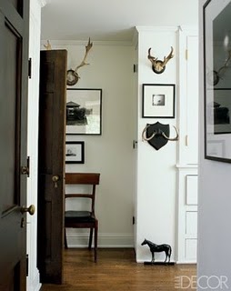
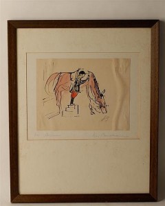
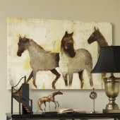
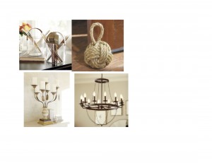
I have never been on a horse or even had the desire to, really. But I love them- I love looking at them, being near them and I really love the accessories & style that go along with equestrian and country living. It is both casual & refined. It’s a country club and a log cabin. I think this may have started with Claire’s boots and long wool skirt in The Breakfast Club. I was a punk rock girl who badly wanted to make out with Bender so I couldn’t justify this style expression in my life then. I would simply file it in my design subconscious.
Styles come and they go and then they come back! I have since bought riding boots ten times over. I started off as a stylist in television land and I have yet to work with a gay Art Director or Production Designer who didn’t at some point send me out for a horn chandelier, faux deer bust, or a pony skin rug to place a Noguchi table upon. I stereotype because I can. Last year, I redesigned the interior of a massive log home in ‘Horse Country’ here in Ontario and spent some time living there myself, once again re-awakening my inner Claire.
It is the Equine Photography of Donna DeMari that inspires me to sit down and write this post. The clarity and beauty of these photographs made me gasp. Once I recovered, it made me want to shop. I hope you enjoy the guide below- click on the pics for a direct link to the source! If you are flush enough to click on the Gucci bracelet, buy me one too. I have learned to mesh my punk rock girl and my inner Claire. I am sure I could pull it off with panache and edge.
Today’s Etsy Picks:
http://www.etsy.com/shop/HoundstoothDesign
*I am looking for submissions & questions for an upcoming Design Advice column. Photos are welcome! Please email me at superlovinya at gmail.


Hey gang,
There’s been some unrest about the site design. I, for one, find it difficult to navigate, and the lack or ability to search by topic/any real organization is frustrating. Plus, it sucks coming in after 12 hours and having no idea where to start/where you left off, etc.
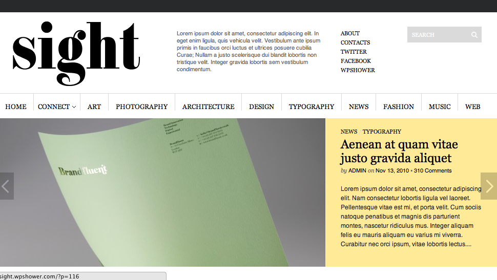
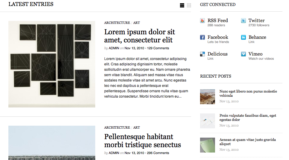
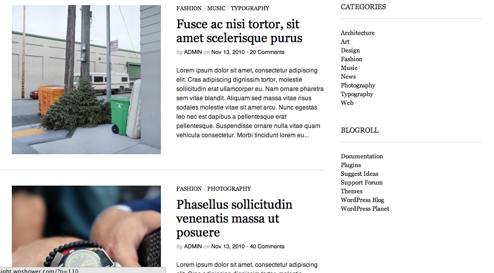
So in that spirit, our lovely coffeeandcigarettes has suggested this one: http://sight.wpshower.com/
I like it a lot! But since Crasstalk is for all of us, let’s have a chat. What do you want? Like? What’s important to you in a site?
A NOTE: All three of the pictures below are of the SAME THEME. I just scrolled down the page, screen-capping as I went. If you click the link I posted, it will take you to it.
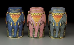
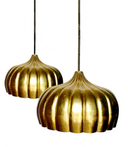
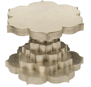
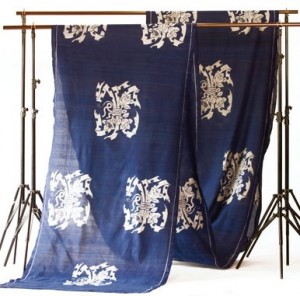
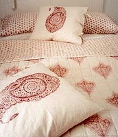
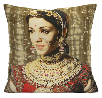
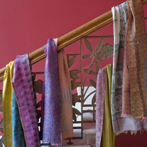
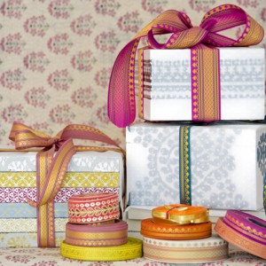
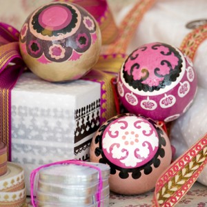
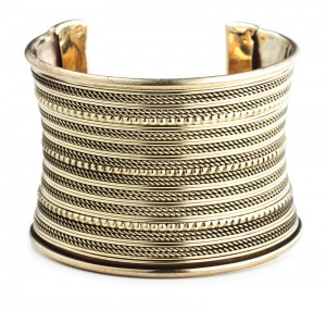
I am lucky enough to live in a city with a thriving & vibrant “Little India” chock full of inspiration and eye-candy. There is something about walking through the shops looking at all of the silver and gold, running my finger along the stacks of silks and voiles that makes me want to change my entire scheme to hot pink & orange. And ride off on an elephant with my Bollywood lover.
Thankfully, the world wibe web provides a little India to shopper’s everywhere.
*If you click on the image, it will take you directly to the site! Learning as I go…
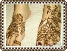


- Mendhi Hand Spice cookies ~ A handmade gift! How pretty to gift these with some beautiful boxed tea. Recipe & instructions at sprinkle bakes http://www.sprinklebakes.com/2010/02/mehndi-inspired-spice-cookies.html
