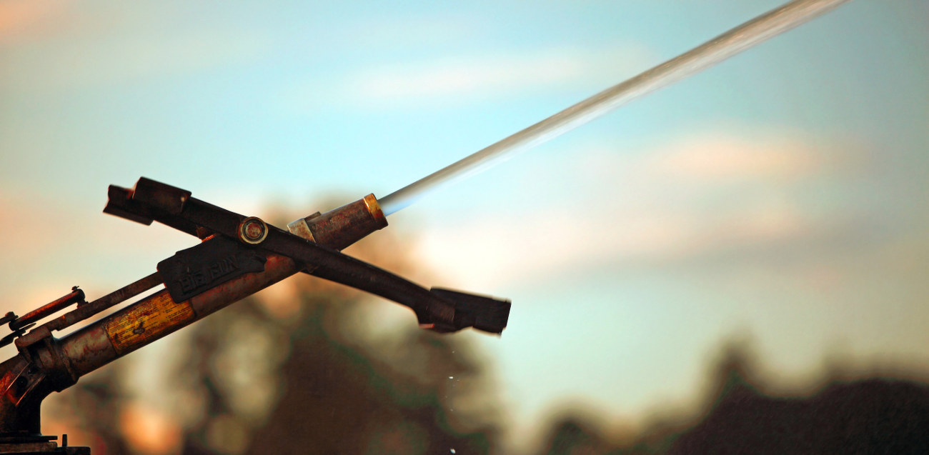
We got to spray just to make it today. Continue reading
color
Remember when you were a kid and in between eating fistfuls of paste you had your box of poster paints? Red and blue make purple, right? So why did it always turn out black/brown-ish purple mess? Because red is not a true primary color. Red has yellow in it. Let’s get past red, yellow and blue with today’s subject, basic color theory. I touched on some of the aspects of this in our previous article but I thought some further information and visuals might be fun.
The two major ways colors are created are applied and light which then play into each other but that’s getting too deep for today.
Put simply, applied is paint, though that is seriously simplified. Pure pigments aside, basically any color can be created using the CMYK breakdown. In printing this is called process color but most art students get to use these colors in gouache for color theory classes . C=Cyan, M=Magenta, Y=Yellow and K=Black. With these four primary colors you are able to create most other colors. C+M=Purple, M+Y=Orange and Y+C=Green for your basic secondary colors. All three together make a warm black. Brights, neons, metallics and white are not possible to create using this method. The large majority of things you see printed in magazines, newspapers, books (not old books), anything that shoots out of your home printer is printed using this way. Art prints often are not and it depends for textiles, but usually not. It is a basic and cost effective way to get the rainbow. An uneven mix of CMY will create a brown. An even mix will create a grey.
Light, on the other hand, is a bit more complex. Light is how most computer art programs function so it’s good to know. RGB are Red, Green and Blue. Secondary are R+G=Yellow, G+B=Cyan, B+R=Purple and all three together equal White light. All brights and neons are possible with this mix. Hence all the bright and shiny colors on your television. Some of the secondary colors seem counter intuitive but if you look at the graphic you’ll see they are basically the inverse of applied color with a couple shifts. Ah, patterns in nature.
As a little interesting end tidbit I left our friend ROYGBIV off of the chart. He is the basic colors visual light wavelengths. He is the rainbow. Red Orange Yellow Green Blue Indigo Violet.
Guy Bourdin is the photographer that all modern fashion photographers should be judged off of. A protégé and close friend of Man Ray his work is part surrealism, part pin-up, part fashion. His eye for color, framing, and negative space makes his photography absolutely extraordinary.
Somewhat NSFW images below the cut. Continue reading

