I feel I need to preface this post with the following: I am not a technologically savvy person. I love my iPhone for the reasons most of us love our smart phones: in addition to making calls and sending texts, I can check Facebook and Twitter and email and the Internet wherever I am. It gives me directions when I’m hopelessly lost (sometimes — ask me about the time I wound up in the middle of a field. The phone said turn right!) It means I’m never without somewhere to eat. It is a portable computer I can fit in the palm of my hand. What’s not to love?
When iOS 7 was released this week, I was, like many of us, a little nervous. I’ve gotten used to my phone working and looking a certain way, and my phone contains very valuable text messages from 2011 and pictures of my socks. If something went wrong with the update and I lost those I don’t know what I’d do.
But, I went ahead and downloaded the update for my iPhone 5. In the end, my curiosity got the best of me. Here are some thoughts, now that I’ve had the weekend to live with the update and play around a little.
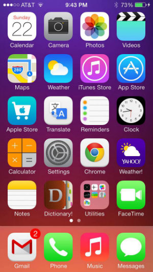
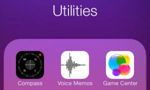
The first thing you’ll notice when you take a look at your phone after installing the update is its brightness. Visually, the new OS is very different. The look of iPhone’s screens hasn’t changed much since the phones were introduced in 2007. Until now, that is. Gone is the 3D, glossy effect of every icon and the mostly primary color scheme. The new OS is flatter and the neon colors of many native applications are initially a bit jarring to see on your reliable old phone. Personally, I’m all for neons. The brighter, the better, I always say! I can definitely see, however, how some users might be put off by a photo icon, for example, which is now a rainbow flower. The Game Center icon (does anybody actually USE Game Center in the first place?) is now what looks like bright-colored bubbles overlapping to form a cluster. I don’t know what that has to do with iPhone games and again, I can see how the bright colors might strike users as more reminiscent of a pre-teen girl’s chosen palette than that of a responsible adult.
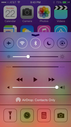
The way the phone works is still more or less the same, although there are a few new features that are nice to see. Swiping in an upward motion from the bottom of the phone gives you a screen with controls for WiFi, Airplane Mode, Bluetooth and more all in the same place. This is great! Gone are the days of trying to figure out where the WiFi controls are in the Settings menu. This screen also has music controls and introduces a native Flashlight app — a little thing that shouldn’t be as exciting as I think it is.
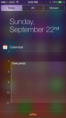
Swiping downwards from the top of the screen reveals the phone’s Today menu, which displays the calendar entry for the day as well as stock information (um … thanks?) and, at the bottom, a quick overview of tomorrow’s events. If you’re someone who relies on your phone as a calendar, this will probably be very helpful. What’s confusing, though, is that sometimes a downwards swipe reveals Today and sometimes it reveals iPhone’s internal search menu. What is this trickery?! I figured out the secret: Start with your finger as high on the screen as it can go and swipe down. You’ll get the Today screen. Start with your finger just a little lower and you’ll reveal the search. Internal search used to be to the left of the Home screen, revealed by swiping or pressing the Home button again. I keep forgetting that my phone doesn’t work this way anymore and get frustrated when I can’t easily look up a song, for example. Don’t try to figure this out while you’re driving.
Apple also chose this update as an opportunity to introduce some new ringtones, which I found exciting. I’ve had the same ringtones on my phone since I first got it, and if I wanted more I had to find somewhere to download them from. Most of the original tones were irritating and distracting, at best (for example, the duck tone and the one that sounds like a Soviet submarine OH MY GOD WE’RE ALL GONNA DIE). The new tones are iPhone, all grown up. They’re simpler and more sophisticated. If you’re someone who likes your phone to quack like a duck or bark like a dog, well … worry not, my friend. You still have the option, hidden under “Classic” tones. Also new are a selection of wallpapers that look beautiful under the newly minimized icons. We also get “dynamic” wallpapers now, or wallpapers that are animated. While they’re kind of nifty, the colors don’t do much for me and I can see how using this option would drain battery like crazy.
Another new feature that had been mysteriously lacking from previous versions of iOS is time stamps for each message sent as SMS or iMessage. By putting your finger on a text blurb and dragging it to the left you’ll reveal the exact time the message was sent. Great for those of us who get irritated with friends not texting back in a timely manner. Finally, we’ll be able to say, with evidence to prove it, “It’s been 20 minutes! Did you text me and then drop your phone and run away when you heard the alert again?”
Overall, I must say I like the new iOS 7. Is it perfect? No. Does it look like it’s trying too hard? Maybe. But it has a lot of cool new features. A lot of people have been experiencing shorter battery life or have had to delete significant amounts of stuff off their phones in order to even install the update, but that is not an experience I had so perhaps I’m a little biased. In the end and in true teacher fashion, I’d give the update a B. It’s a solid update and offers new features and options that were previously unavailable on the iPhone. Could they have given us more? Of course. I’d like to see some more customization options, but let’s remember who we’re dealing with, here. Apple is not known for letting its users customize much of anything. Such is the beauty of an Apple product for many: it’s elegant and crisp and not bogged down with too many colors or fonts.
All in all, I like the new update, although I can see where many people might take issue. Change is hard, and no redesign is ever going to be perfect. Somebody will always take issue, especially when the changes are so extreme. But if you give yourself a little time to get to know the new system, you just might find something you like. Now, excuse me. I need to go listen to all those new ringtones again and pick one that perfectly represents my personality.
All images are screencaps from the author’s phone.