Yesterday Gawker Prime rolled out the latest in a never ending effort reinvent itself. All sites get redesigns otherwise they would become stale and outdated. Gawker takes special pride in doing new and risky things with their designs. Let’s climb in the Wayback Machine and look at the different incarnations of Gawker throughout the years.
Here we are in February 2003. The space shuttle Columbia accident was fresh on everyone’s mind and Gawker was bringing us important news about pajama parties and “fatties” on the runway.
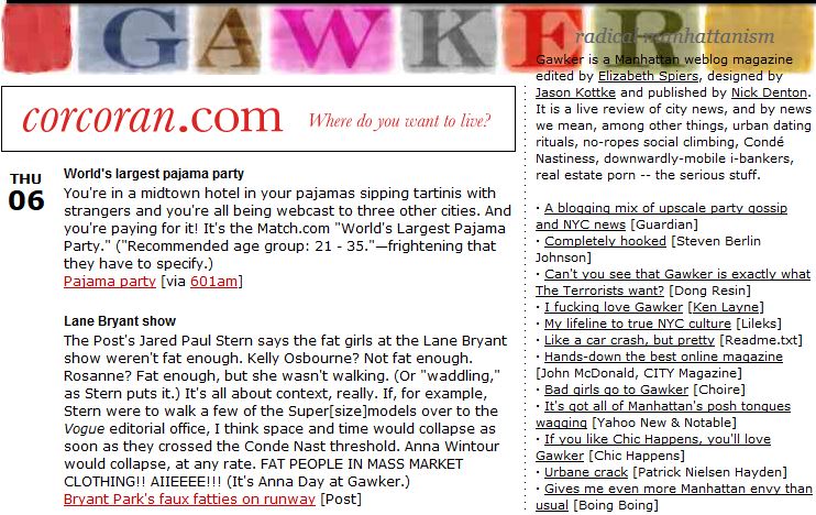 Pretty standard stuff. The date, some link dumps with short descriptions and a sidebar with recent posts. Oh, and an ad for Corcoran.com (“Where do you want to live?”).
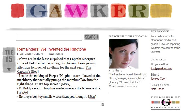
Then nothing much changes for many years. In March 2005 some subtle design elements from the stylized Gawker header are brought down into the desing of the page. Somewhere along the way the sidebar was revamped a bit. The nice lady in the ad is for the Gawker personals section. That was surely meant to compete with Backpage since it generates so much revenue for the Voice the idea was surely an easy target.
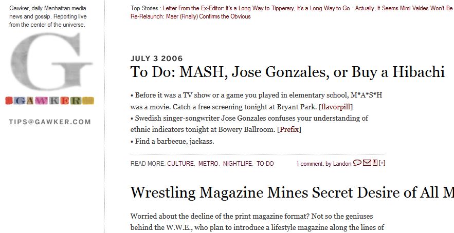
 The first really big change came in July 2006. The sidebar went to the left, the content column got bigger and single G logo makes a much bigger appearance.
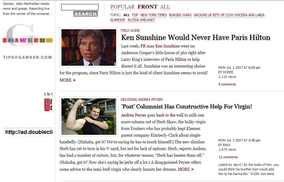
 July 2007 brings some tweaks to the design to clean things up, add some drop shadow to the headlines and bring the post metadata out to the side from underneath the post. Oh, and Paris Hilton in depth news and reporting. A very important thing happened here, pageviews were added. Most sites do not list pageviews for each post but Denton decided to add it, probably as a brag since things were starting to really take off.
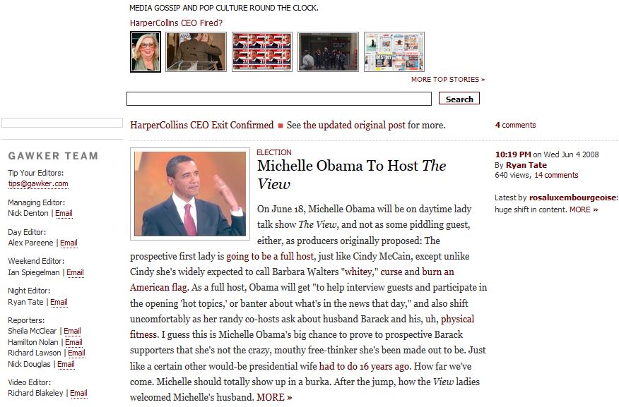
 Due to some strangeness with the Wayback Machine the next change that can be observed comes in June 2008. The drop shadow is gone and the header is reorganized.
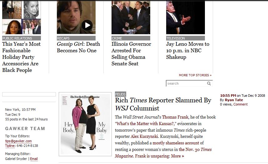
 The December 2008 snapshot is only a little different, but it puts the featured posts at the top in a much more grand way and shortens text before the jump. Shortly after this color coding based on content was also added.
 Then in February 2011 the big change happened. Though due to the hash bang URL structure it appears the Wayback Machine was unable to scrape the site and could only capture this.
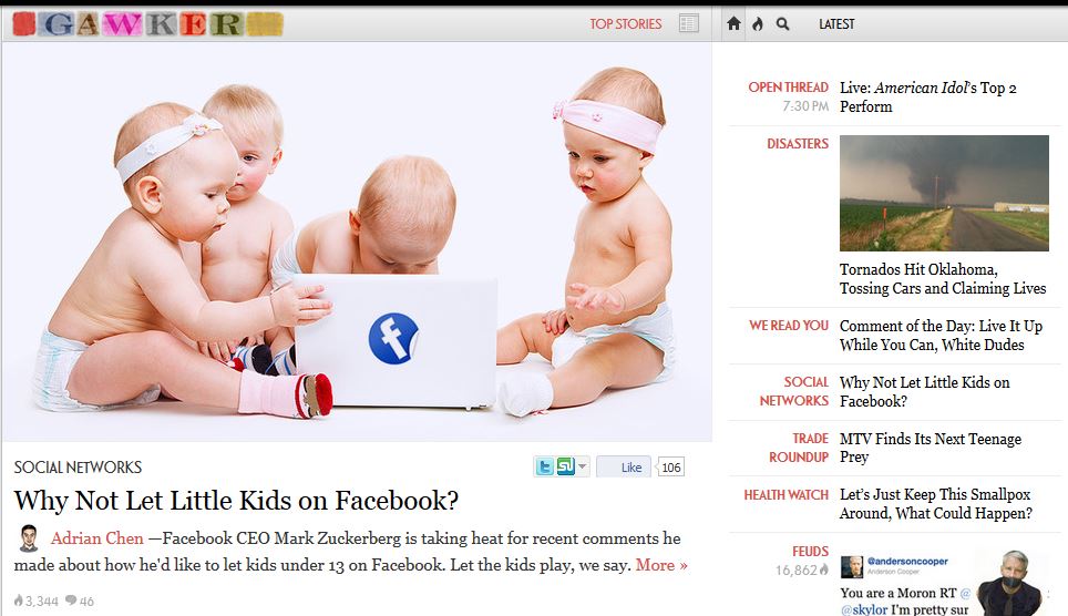
 It wasn’t until May 2011 that the scraper was able to pick things up again and things were full swing dual scroll bar. Bigger images, all the posts on the right, the ones deemed important on the left.
 That’s largely where things stood, with some minor changes until now.
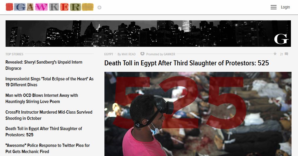
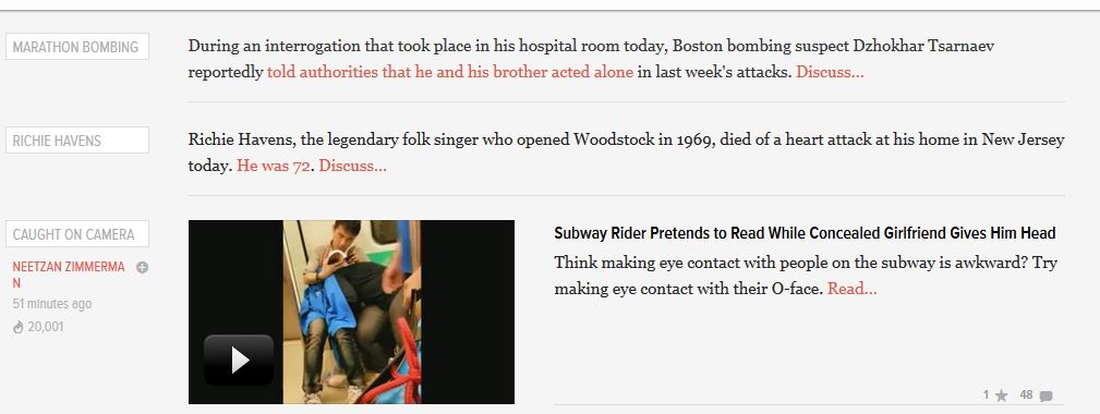 And now in August 2013 they have done it yet again. With top stories on the left and a new header image of a black and white skyline. Don’t stop changing Lord D, don’t stop changing.
One thing that is clear is the desire to get more links to content in your eyeballs. Which given the amount of content that the GM empire has that’s probably a smart move.
Photos screen-captured from the Internet Archive Wayback Machine.